How to create an eye catching infographic

Infographics are a fantastic way of marketing your business, and getting useful information in front of your core audience. When you consider that most internet users prefer to learn about and understand data visually, it’s no surprise that infographics are a popular choice for internet marketers.
Presenting your information in an attractive, concise and eye-catching way can go a long way in attracting your target audience and reach your marketing goals. Infographics can be a straightforward, effective way of achieving this – and with good research, your infographic will stand the test of time.
But what if you have no design skills? What if you can’t draw a house, let alone create an infographic?
Well, fear not! You don’t need to be a graphic designer or illustrator to be able to make an eye catching infographic. In fact, using the right tools, you can create a successful and visually pleasing infographic with little to no prior experience.
In this guide we aim to show you step-by-step how you can create an infographic for any given topic, from the ground up.
So let’s get into it!
1. Planning your infographic
Before creating any form of content, it’s extremely important that you take the time to properly plan out how, and what, you’re going to create. Failure to do so translates to you effectively shooting yourself in the foot before you’ve even started!
1.1 Set your topic and goals
The very first thing you need to do is decide exactly what topic(s) your infographic is going to involve. You can even start this by simply brainstorming ideas and seeing what sticks.
To get a proper picture of the kind of content you should aim for, you want to take a look at your target audience and dig into their interests, as well as the kind of information they’re looking for. At the end of the day, any good infographic will provide useful information and this information should be valuable to your audience.
Along with this, you want to define exactly what you want the infographic to achieve. An infographic can have many purposes, or marketing goals that you’d like the content to fulfill. An few examples of these could be:
- Spreading awareness of your brand, or a specific piece of information
- Bring traffic to a website
- Guide people towards downloading a resource
Regardless of what goal you want your infographic to meet, you should ensure that you decide on this early, and keep it in mind throughout the creation process. This isn’t just limited to one goal – so if you have several marketing goals for the infographic, make sure to consider them all.
1.2 Research and inspiration
Now that you have a good idea of the area you want to cover in your infographic, and the goals you want to reach, it’s worth spending some time researching and finding inspiration.
Whether you’re a designer or not, making an infographic is at its core, a creative process. So as with any other creative process, it really pays to take a look at the competition and find some inspiration. You don’t want to create an infographic and then find out someone else has done the same, but better!
Ask yourself – can I provide a fresh perspective on the topic? Can I provide a more thorough look at this topic than the competition?
Not only will you be able to get an idea of how other people have covered your topic, or related topics, but you can also find inspiration in terms of how you want the infographic to look.

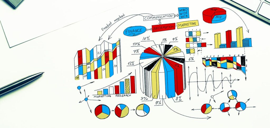
2. Content for your infographic
As infographics are essentially a visual representation of data, the next logical step in creating an infographic is gathering and sorting the information that’s going to be represented.
2.1 Gathering and sorting data
In order to provide information of the best value to your audience, you want to use only quality data. Misleading your viewers or providing false information is just asking for trouble!
The first step is gathering the data relevant to the topic you’re covering in your infographic. There are countless ways of doing this, and some of the best sources can be found in:
- Surveys
- Published articles or journals
- Books
- Reports
- Official statistics
Once you’ve amassed a sizable collection of data, you can move on to sorting the data.
At this stage you’ll now want to filter the data you have until you have only the important, most valuable data left. Here you should discard any data that isn’t relevant or valuable, leaving a much smaller set of data that you can use in your infographic.
It’s very important to keep a note of all of your sources – and if you find any sources that aren’t totally credible, then that associated data is useless and should be discarded!
2.2 Craft your headline
One crucial aspect of a successful infographic is using a catchy, appealing headline.
The headline will be the very first thing that your audience sees, so it needs to be concise, while also conveying the purpose of the infographic. Long, wordy titles should be avoided, as that will only turn away most viewers.
If you’ve spent a good amount of time planning the infographic then you should have decided on a target keyword to use in the title. Make sure that this is front and centre, or as close to the start of the title as can be. The headline should be straight to the point, ideally with a clever hook to draw people in.
2.3 Plan your content outline
Before we move into the design phase, you can take a bit of time to plan how the content on your infographic should be structured and displayed.
There are several popular types of infographic, each structured in a different way, so now is a good chance to decide on how you want the information to be laid out. You can always do this at a later stage, but you can save time by doing this earlier.
Here are some examples of the most popular infographic structures:
- A Story – this type of infographic would be laid out in the traditional introduction – body – conclusion structure. Body text is usually separated into small paragraphs beside graphics to make for easier reading.
- Numerical/Alphabetical Order – here the infographic would be laid out in a descending numerical, or alphabetical, order.
- A Timeline – this type of infographic would have information arranged according to the time at which the events happened.
- Pro/Con Comparison – here you would have content divided into multiple vertical sections, structured in a way that compares the two sets of data.
These are just some examples, but if you manage to decide on the structure before moving to the design phase, you can save yourself valuable time!

3. Design your infographic
Now after planning and gathering our data, we can get into the bread and butter of infographic creation – the design!
3.1 Choose a customisable template
Instead of hiring a graphic designer or learning design skills yourself, you can make use of customisable templates to easily create a visually appealing infographic from the ground up.
Now there are dozens of different tools you can choose to achieve this, with varying levels of functionality. Some only provide very basic infographic creation features, while some provide much more functionality.
Here are some examples of good customisable infographic templates:
Most of these will provide you with a basic structure, which can then be built upon with the appropriate content.
3.2 Adding your content
Now you should have a solid base for your infographic, with a proper layout and structure to follow. Finally, we can get into adding the actual content!
Where you place the data you’ve collected is going to depend on the structure that your infographic takes. For example – in a comparison-style structure, where two sets of data are being compared against each other, you would have each corresponding set of data laid out into two vertical columns.
When adding your information, you should ensure that the most important information is clearly visible near the start of the infographic, so that it doesn’t go unnoticed.
Any text that you’ve written can also be added to your infographic structure at this stage, making sure that all text is to-the-point, captivating, and not overly long. People aren’t going to read long paragraphs of text on an infographic so it’s best to avoid that.
Graphical content can also be added here, if necessary. You may have some stock graphics you want to use, or maybe you’ve had some professional graphics already created. Make sure any graphics are relevant to the data and as always, eye-catching!
Sources matter as well! Try and list your sources at the bottom of the infographic, to add some credibility to your information.
3.3 Choosing colours, font, and background
With the content added to your infographic, you can now begin finalizing the visual aspects of the infographic. At this point you should be considering things like text colour and size, the font to use, the background, and any formatting.
For the font, you have some freedom in what you choose – as long as it’s readable! You want to use a font that’s recognisable, clear, and brings attention to the text.
Your text should stand out and contrast to the background colour, to emphasize the information you’re getting across. Sizing will be variable, but as always you’ll want the most important information to be clearly visible, which can mean a larger size!
For the background, you’re going to want to spend a little time determining the best colour to use. Too dark a background, and you risk obscuring the purpose behind the infographic. Too light a background, and the data you’re showing might not be immediately noticeable! You should try to strike a balance between the two, while keeping a level of contrast between the font colour and background colour.
3.4 Branding and CTAs
You should, by this point, have a great looking infographic with a clear visual identity. The only thing left to add now is your company’s branding, as well as any CTAs, or Call-to-action. A CTA is something that you intend the user to interact with and take a specific action – typically this will be something like downloading a resource, visiting a website, or subscribing to a mailing list.
Branding is pretty important and it’s definitely not something you should forget about. Adding this links your company or business to the infographic itself, and effectively gives you ownership of what you’ve created. It can also be a great way of bringing in new prospects, because if the viewer finds some value in the infographic, there’s a chance they might want to look at what else you have to offer.
This is often achieved by simply adding your company’s logo to the infographic. You may also want to integrate your company’s colour scheme, slogan, or any other elements that make up your brand’s visual identity.
The last part of your infographic should be adding a CTA. First, check your marketing goals to determine exactly what actions you want your audience to take. You can then use this information to add the right call-to-action for your infographic. Regardless of whether you want them to visit your website, or to download a PDF, don’t forget to add it!

In Conclusion
Infographics are a powerful marketing tool, offering an engaging way to share unique and valuable information with your audience. Whether you’re an experienced graphic designer or a complete beginner, creating impactful infographics has never been easier, thanks to the vast array of tools available online.
At UKHost4u, we make getting your business online simple and stress-free. Our WordPress Hosting Plans are perfect for creating stunning websites, even if you’re a beginner. With our reliable hosting solutions, you’ll have everything you need to showcase your infographics and grow your business.
Need Help?
Our team is here 24/7 to assist you with any questions or technical issues:
Start building your online presence today with UKHost4u and bring your infographic ideas to life!